The continuation of game data EDA. Plus, an app!
Definitely Gaming for Scientific Reasons, Part 2: Electric Boogaloo
Welcome back, unfortunate souls. Last time (...on Avatar), we gallivanted through the gathering and cleaning of some data from Moby Games, a website purely for collecting and managing game information. We did some basic EDA and thought a few things looked mildly interesting. Now, onto part two of this thrilling saga.
Key Insights?
Honestly, there wasn’t anything jaw-dropping or super amazing in the data, at least not that I found. I mean, here’s a boxplot if you want it.
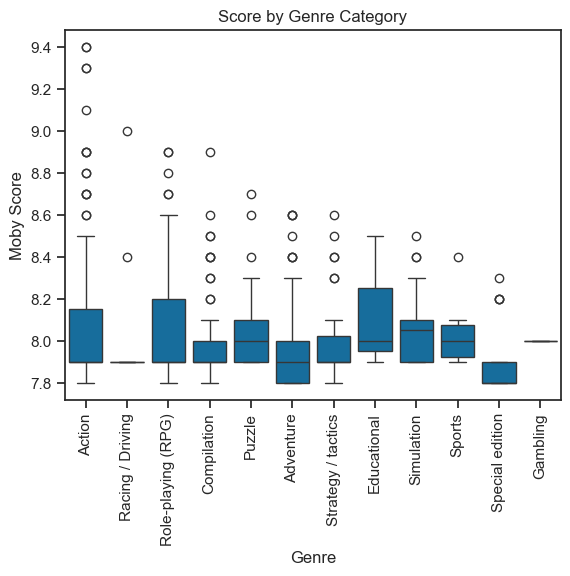
A majority of the games were rated in the 7.9-8.2 range. Since these games are the top 550 from the Moby list of Nintendo Switch games, that doesn’t surprise me. Action seems to have the most outliers, though none of the genres have a Moby score (a “number based on a bayesian scale critic and plater ratings”) above 9.4. But we all know what critics are like, so again, that isn’t a shocking development.
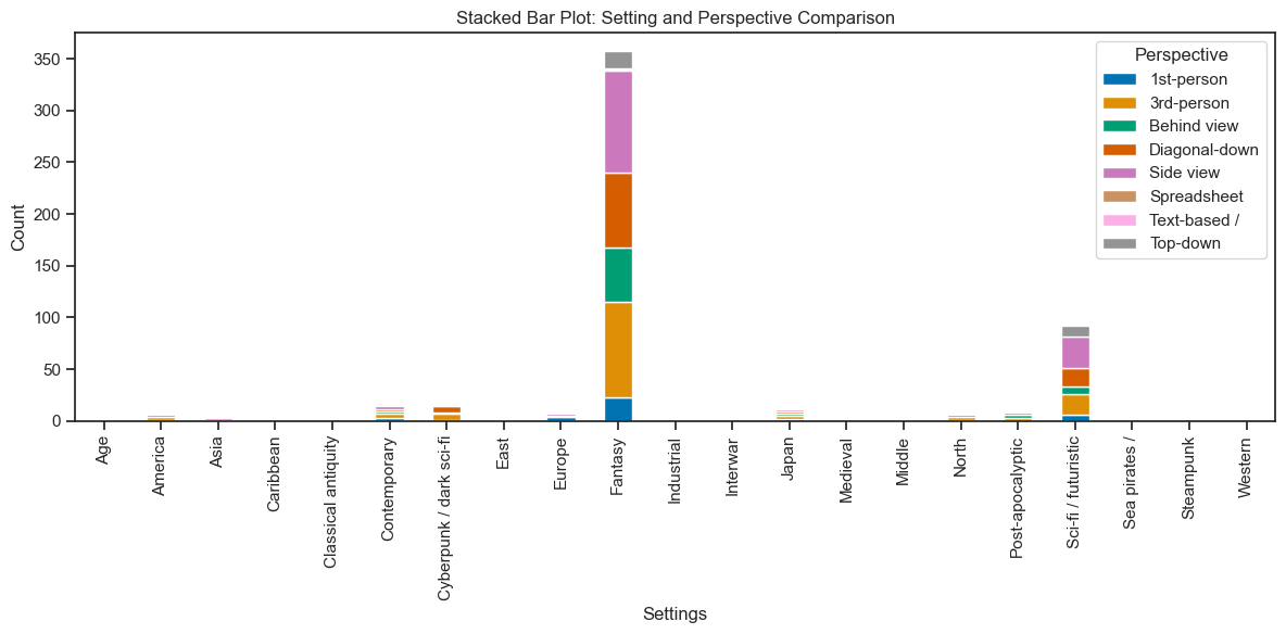
Unsurprisingly, fantasy seemed to be the most popular genre among the games. The most common perspectives among the genres were third-person and side view. (So, not Minecraft.)
In my previous post, I mentioned that there was a noticeable dip where there weren’t as many games being released in 2020. Take a guess as to why. (Oddly enough, the one gambling game I have in my dataset was released in 2020. Go figure?) This is easily seen in the ‘Explore’ tab of my streamlit app, specifically the first graph. But that’s a topic for… now, actually.
(N)App Time
I present to you… Playing with Game Data, the app. I know, the name’s so clever. Hilarious. It makes for a lot less work to filter the data set (if you didn’t code it, at least) and see cool graphs with the click of a button.
Tab 1
It’s relatively self-explanatory. The first tab is just a few widgets for people to mess around with to their heart’s content, aka for ten seconds. For the first plot, you select a genre and it displays a simple graph depicting the number of games released per year in that genre.
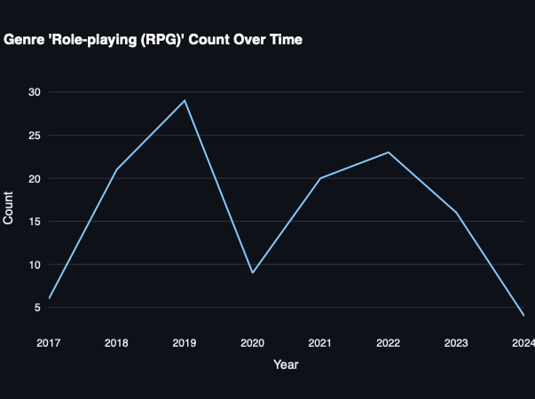
As the title says, I selected ‘Role-playing (RPG)’ from the genre list and got this lovely little curve back.
The second plot is a stacked bar graph. You can select multiple game settings (as in world setting, not interface settings) and they’ll show up on the bar graph, stacked on top of one another. If you hover your cursor over a bar, it’ll tell you the exact count of each setting per year.
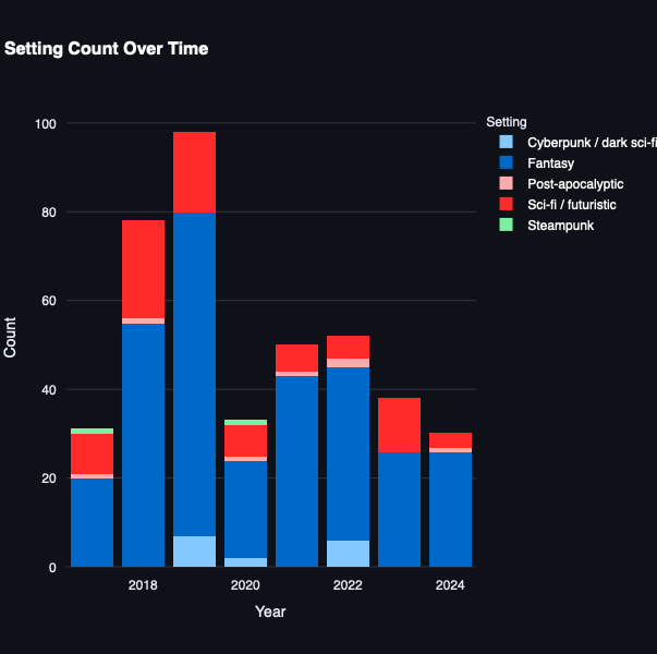
I selected my favorite settings and got this lovely thing.
Then there’s release month, which isn’t particularly useful… but is kinda fun to slide the dot around. As I mentioned previously, April has the least amount of releases, with only 26/550 games being released on the Switch that month.
Tab 2
This one’s my favorite. You select a genre, one or more gameplay options, a setting, and a minimum critic score to see a dataframe of all the games that match your criteria. Since my dataset is pretty limited, it’s not as cool as it seemed in my head. Oh well.
Tab 3
Unfortunately, this widget ended up being difficult to use considering how case sensitive it is. If you miss an apostrophe or space, it’s over (for a second). If you know the exact name, though, it’s not too bad.
As for you…
I wanted to keep this a little shorter for ease of finals week peer reviewing. (It has nothing to do with a lack of creativity.) Hopefully it wasn’t as boring as your 9 A.M. history class.
Anyways, the interactive widgets on the app provide for a bit of personal analysis, should you wish to waste your time doing so. I’d be curious to know if there’s any kind of association between gameplay and critic rating, as an example. Or which settings and genres go together the most often. It’s not like I could go do that myself; obviously, you have to go check it out.
Go find a genre that interests you and take a look at some of the games you might be interested in once you have more than a minute of downtime. Good luck with finals, everyone.